Learning about Value Contrast
In my online artist mentoring program Visual Artist Accelerator, we learn how to tap into our creative practices, deeply and radically. We also take some time to dive into basic design principles including line, shape, texture, perspective/illusion of space, motion, and value.
I can't tell you how exciting and invigorating it is to revisit these principles and discover together the language and core elements of design and composition!
One of my favorite design elements to talk about is Value. First, I want to tell you a secret: Value is just a fancy art word for light and dark, relative to each other. Think: black and white photographs. Value refers to the relative lightness and darkness of shapes in a composition. To understand value, there are some helpful terms to know including: value contrast, value pattern, value emphasis, and value as a device to create space and perspective.
Using examples from the world of art we can learn how artists use value contrast. Understanding value contrast can help you add a new dimension to your own art. Value contrast refers to the amount of contrast between two areas of different value. It’s the relationship between a light area and a dark area.
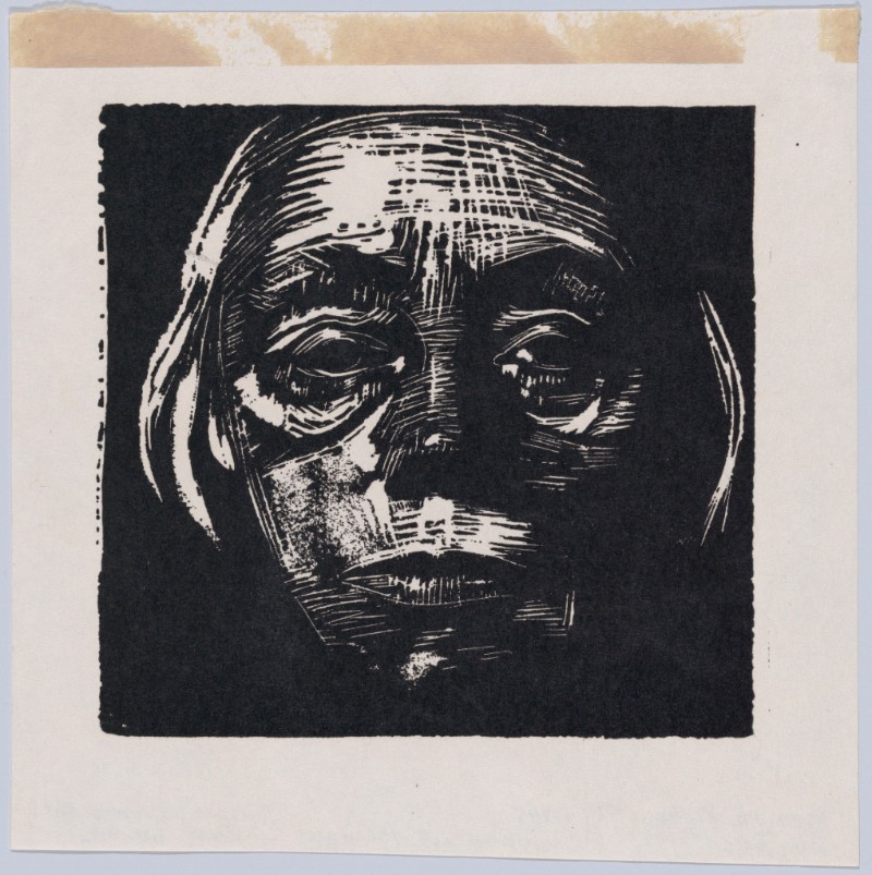
There can be high contrast (a big difference between light and dark) and/or low contrast (not a big difference between the light and dark). Käthe Kollwitz’s Self-Portrait is a great example of high contrast. There is bright white as well as deep, dark black. The effect of this high value contrast is that it really pops.
Self-Portrait
Käthe Kollwitz (German); Date: n.d.
Medium: Woodcut facsimile; Metropolitan Museum of Art
Gertrude Käsebier’s Blessed Art Thou among Women is a good example of low value contrast. All of the tones are muted. Even the darkest shadows are quite softened, and the brightest tones aren’t particularly light.
Blessed Art Thou among Women
Gertrude Käsebier (American); Date: 1899
Medium: Platinum print; Metropolitan Museum of Art
Did you know there's a quick and easy way to check the value contrast of your work? For many of us, it's quite handy too. Just take a quick pic of your work with your camera using one of its black-and-white modes! See the example below of a side-by-side comparison of my painting Opal Creek Oregon. On the left is the image using the normal color mode and on the right, the same painting using the Silvertone filter. Looking at your work like this, can you spot the high-contrast or low-contrast areas? Are there areas of bright whites and deep darks, or are the tones soft and muted? Give it a try with one of your pieces and see what you can learn from this experiment!


